

Japanese Candlestick Charts: A Key Tool in Excel for Technical Analysts
For technical analysts, the Japanese candlestick chart is an indispensable tool. Regardless of whether you’re a novice or an expert in price action trading, these charts can be the key to unlocking significant profits in stock or commodity markets. In this post, we’ll explore the process of creating a candlestick chart right in Excel, utilizing its built-in capabilities without the need for any external tools or plugins.
Additional Learning Resource: Calculating XIRR in an Excel Sheet
Decoding Candlestick Charts
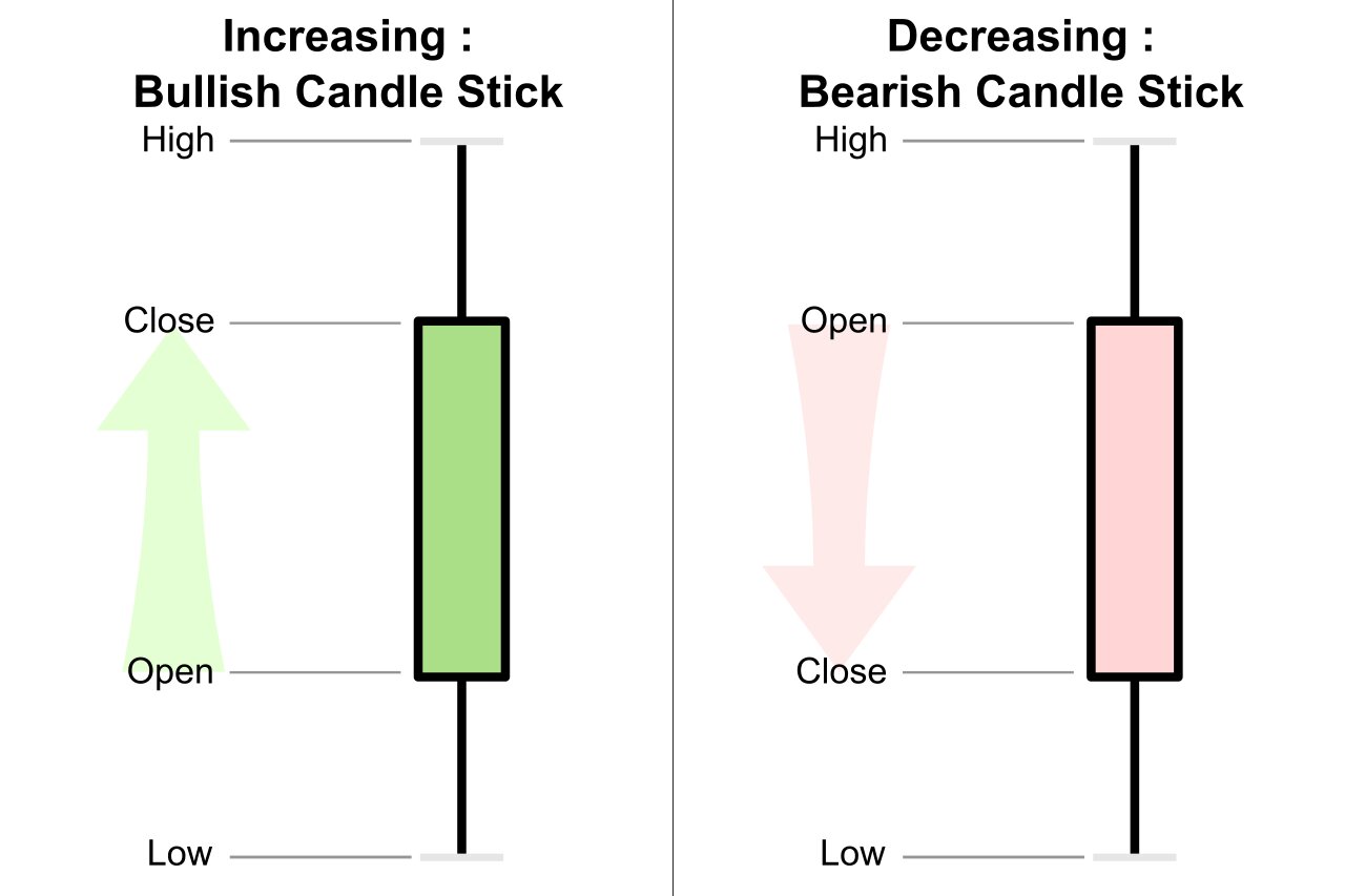
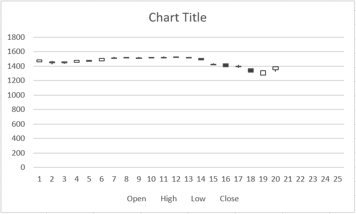
So, what exactly is a candlestick chart? It’s a unique way of presenting open, high, low, and close prices of securities. The chart comprises individual ‘candles’, each with a body indicating open and close prices, and wicks for the high and low prices. Red or filled bodies suggest a closing price lower than the opening, while green or empty bodies show a higher closing price.
 Traders often analyze these candles, representing different timeframes like days or months, to gauge market sentiment and momentum.
Easy Steps to Plot a Candlestick Chart in Excel
Creating a candlestick chart in Excel is straightforward, and here’s how you can do it. These instructions are primarily for Microsoft Excel 2019 but apply to other versions as well.
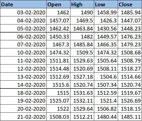
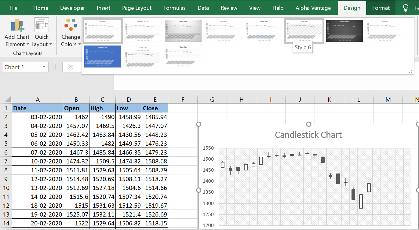
Organizing Data: Begin by sorting the open, high, low, and close data in Excel columns, arranged in ascending date order.
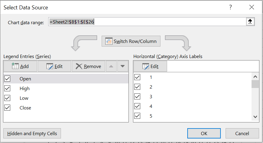
Selecting Relevant Data: Highlight the columns containing open, high, low, and close data for the chart.
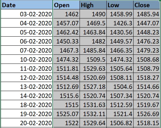
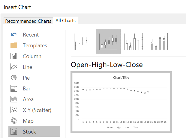
Chart Initiation: Go to the Insert menu, choose Recommended Charts, then All Charts, and finally, select the Open-High-Low-Close option under Stock charts.
Finalizing the Chart: Excel will generate a candlestick chart which you can then reposition or move to another worksheet as needed.
Now, let’s turn our attention to refining the chart for better visual appeal and clarity.
Chart Customization: Right-click on the chart, choose ‘Select Data’, and ensure the data range is correct. Adjust if needed.
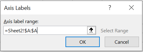
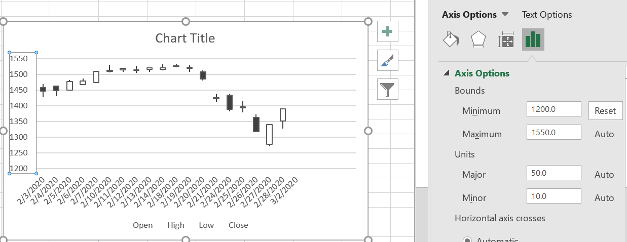
Axis Labeling: Under ‘Horizontal (category) Axis Labels’, edit the axis label range to match your data.
Enhancing Date Display: Fine-tune the horizontal axis for correct date representation, especially for non-trading days.
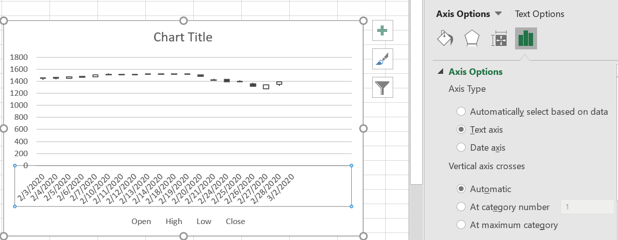
Vertical Axis Adjustment: Customize the vertical axis to fit your specific price data range.
Title and Legend: Update the chart title and remove the bottom legend for a neater presentation.
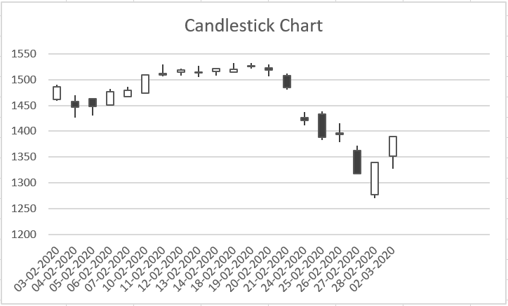
Design Selection: From the top design menu, pick a template that enhances your chart’s visual impact.
 For deeper insights: Discover Candlestick Patterns in Stock Analysis
Download the Ready-to-Use Excel Template
Access the Excel template to effortlessly create candlestick charts via the link below:


3 Comments