Candlestick charts are something many of us know well, and they are believed to have originated in Japan. Another helpful chart that Japan introduced is the Renko chart, which isn’t as commonly used as candlestick charts but still holds popularity among traders.
Building Renko Charts
Derived from the Japanese word for bricks, ‘renga,’ It resemble a series of bricks. Whenever the price moves by a preset amount, a new brick is added to the chart, either above or below the previous one, based on the price’s direction. Typically, bricks that indicate an upward move are green, and those indicating a downward move are red.
Read Also: Grasping Candlestick Patterns in Stock Analysis
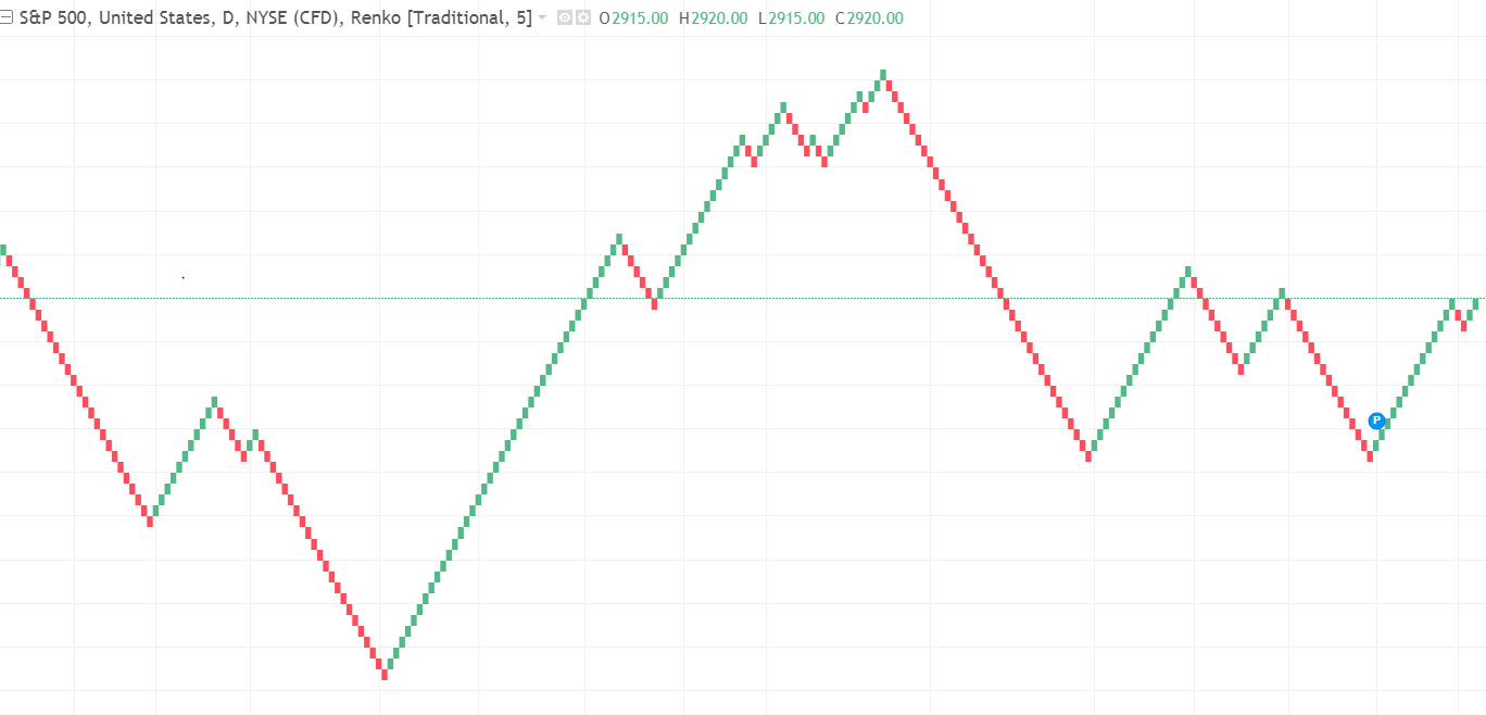
Unlike candlestick charts that depend on time and price, Renko charts focus solely on price changes and ignore time. Imagine it like this: candlestick charts plot a new candle for each day, hour, or minute, while Renko charts only take shape when the price shifts a certain amount in one direction. This distinct characteristic strips away the clutter from the charts, making it simpler for traders to spot trends and opportunities. Below, we have a sample S&P 500 chart from investing.com illustrating this concept.
 The ‘brick size’ or ‘box size’ is the set amount that the price must change to add a new brick. Users can choose to set this size to a fixed value or link it to the stock’s ATR (Average True Range), which gauges volatility over a certain period. It’s crucial to note that Renko charts are created using only closing prices.
For a clearer picture, let’s take an example: a stock is priced at $100 with a brick size of $1. If the price climbs to $101 or more and closes there, we’ll see a new brick. However, if it peaks at $100.50 but doesn’t close, no new brick appears. Once a brick is in place, it stays put. If the price then jumps to $102 and closes, another brick is added. Renko bricks stack vertically; thus, if the price dips back to $101, we won’t see a new down brick next to the last up brick—the price must fall to $100 for that to happen.
Trading with Renko Charts
Here are a few tried-and-true methods for leveraging Renko charts in trading:
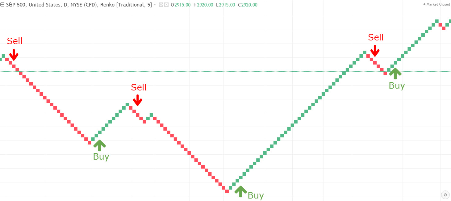
Spotting Trends
Renko charts, with their reduced clutter, aid traders in spotting trends more easily. Traders might choose to buy based on a sequence of three green bricks forming in a row and switch directions when three red bricks do the same.
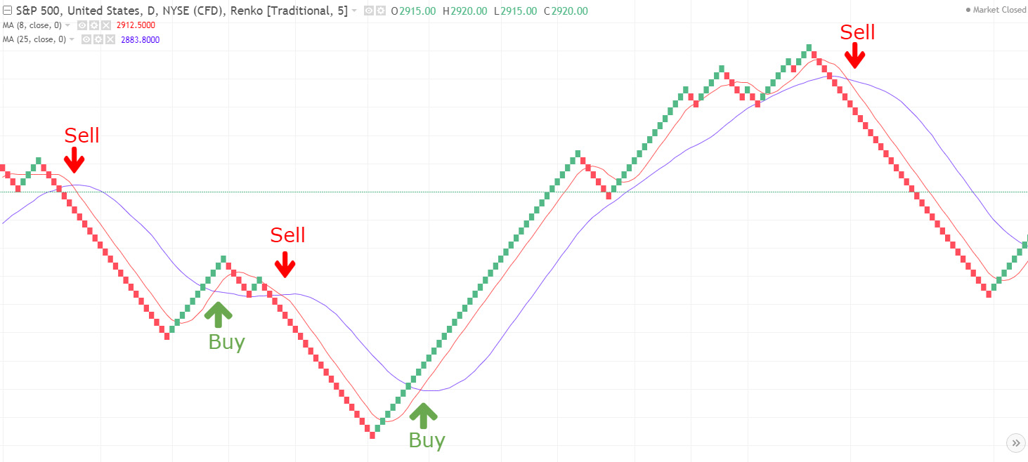
Combining with Other Indicators
Integrating other indicators to craft a trading strategy can be effective. For instance, initiating a buy when an 8-period moving average crosses over a 25-period moving average, and conversely selling. These are just starting points; it’s up to you to discover the approach that fits your style.
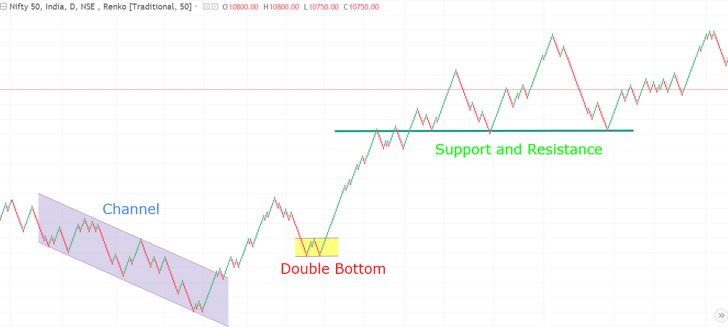
Detecting Supports, Resistances, and Other Patterns
It’s not just trends that Renko charts simplify; they also make spotting technical patterns like supports, resistances, and more intricate formations such as head and shoulders or Elliott waves much clearer.
 Read More: Simplifying Price Action Trading
Limits of Renko Charts
- Renko charts don’t factor in time, which can sometimes give traders the wrong impression. For example, a stock that hasn’t moved much for a while may appear as a single box, which can be deceiving.
- They only reflect closing prices, leaving out high and low fluctuations. While this reduces noise, it also omits key information, which is why solely relying on Renko charts for trading decisions can be a gamble.
Final Thoughts
Renko charting is a powerful tool that, when applied wisely, can be a valuable part of a trader’s toolkit. Nevertheless, it’s not a magical solution; you should experiment to see how Renko charts can enhance your trading strategy.